A Home In The Desert
Progress report 10SEPT
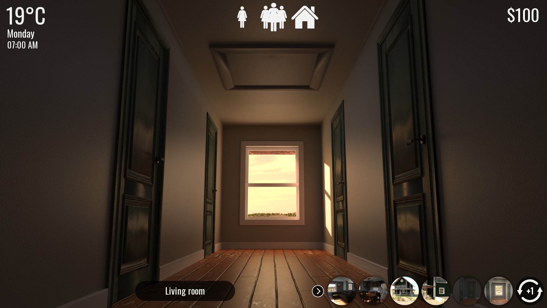
I got busy lately, I can tell you that. First things first, last time I talked to you guys about improving the HUD. Here's what I have right now:

As you can see, a few things changed, even compared to last time. The temperature is now about as present as it is on the old HUD, and all the information about the current time of day is now regrouped. I have to be honest with you: I just took inspiration about my own phone's UI ^^'. I figured if I had to improve the UI, maybe it was actually smart to take inspiration on something we all know.
Other than that, an other obvious addition are the navigation buttons. Now you can have direct access to the Desert House's major locations. Those are: the corridors (ground floor and first floor), outside the house (front), outside the house (back), the living room and the kitchen.
Think of them as "fast travel" buttons. Their main purpose is to save the player some clicks. When before, if you wanted to go from your bedroom to the back of the house you had 4 clicks to do, now one is enough. If however you want to keep the more "immersive" approach for whatever reason and you still want to navigate around the house location by location, you can dismiss the "fast travel" navigation buttons by clicking on the small arrow that's on their left. Lastly, a button to "go behind you" was added. I know those were had to find/click before, so now whenever you want to leave a corridor or something, the button to do so is an "always on display" one. Meaning you don't have to try and hover over the button, you can just click the dark one labelled "living room" or "kitchen".
That's all for the navigation.
An other change are the "time skip" buttons. They're not at the top of the screen anymore, but at the bottom. Additionally, they're deployable to save space (just hover your mouse over the 1 hour button for a quarter of a second, the other buttons will deploy).
There is a small video demonstrating how this works but you're going to have to check this progress report on my Subscribestar page for that. Itch.io's text editor won't let me put a video unless I uploaded it somewhere first -_-
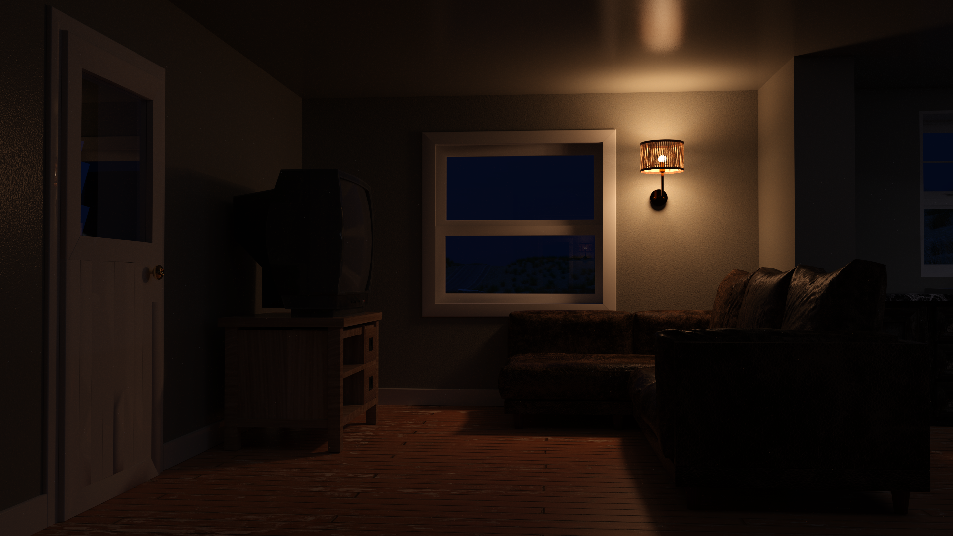
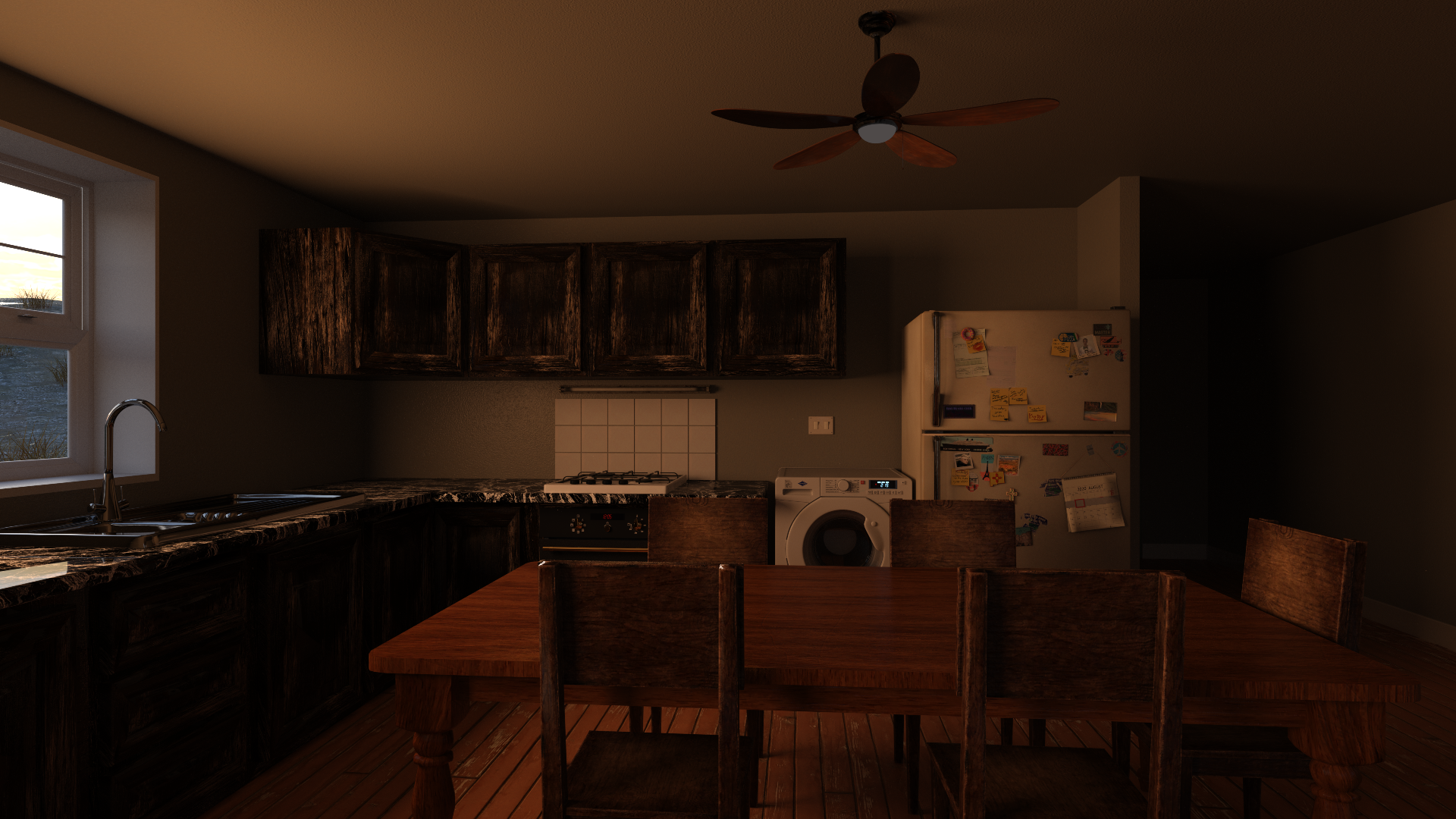
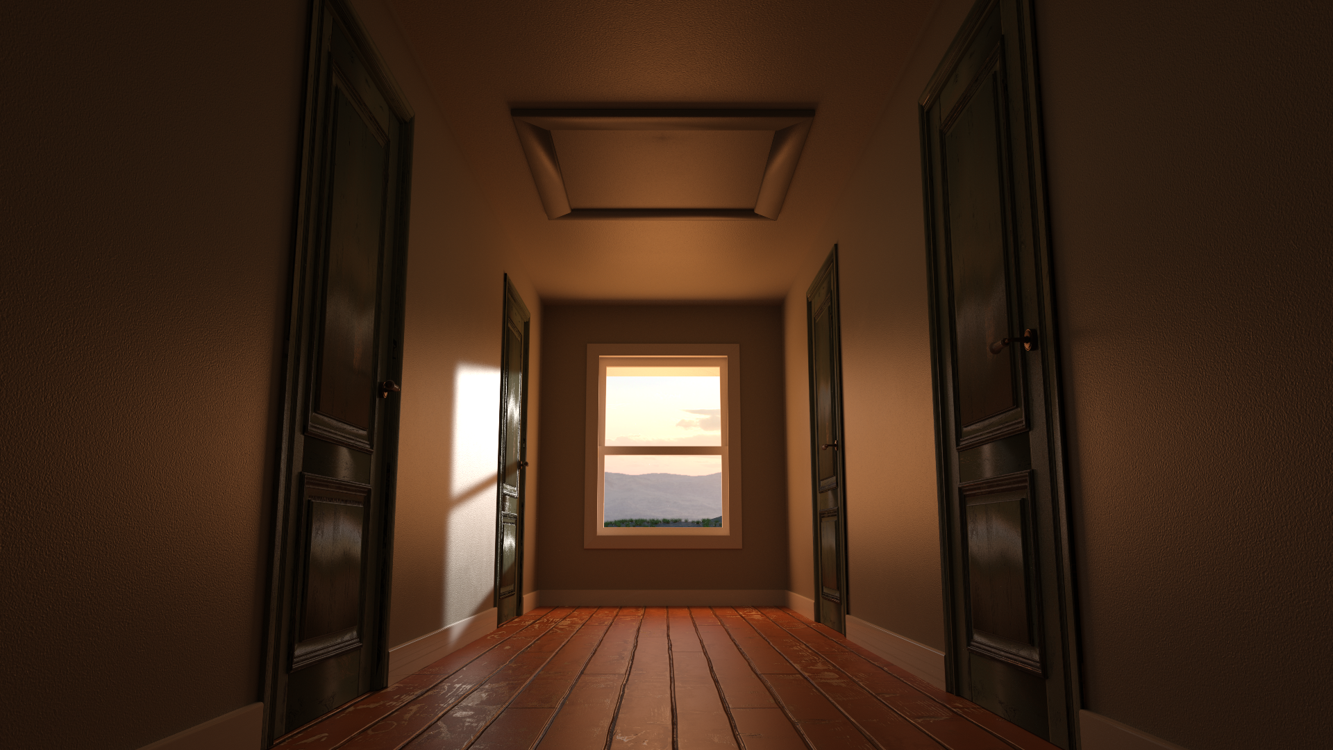
Now I should probably address the elephant in the room. Yes, the corridor doesn't look the same. Here are the new and impoved locations in all their glory:


Those improvements were brought to the game for a few reasons, but the main one is that they were absolutely not optimized for navigation. One blatant example of this is the front door not even being apparent on the previous version of the living room. The attic hatch being way more obvious on the corridor PoV is also a major advantage.
An other reason is sepparation. Having the living room and kitchen not properly sepparated before caused a few issues, mostly of the continuity kind. And having to make the characters appear both on the living room and kitchen was double the work for me.
Lastly, I took the occasion to try to make them look better. I think I did a good job, but you guys be the judge.
Lastly, you guys might have noticed the meter at the bottom left of the screen that was there last time isn't there anymore. That's because last time's screenshot was taken from my drawing software, not from the game itself, unlike today's screenshots. And this meter is simply not implemented yet. I'll work on that during the coming days though.
Pheeew, that was a lot of HUD talk...
The introduction and first quest additions I talked about last time were implemented (I did that on stream recently), but not fully tested yet. I actually need that meter I just talked about to be implemented before I can fully try those scenes out.
OKAY, we're finally getting towards the end of today's progress report. It was a big one.
I still have a few things to work on before those improvements are done, but I'm confident that I can finish everything by the next progress report. I'll keep you guys posted, of course.
Until then, take care of yourself in this fine beginning of September :)
A Home In The Desert
An adult management game, with strong incest and futanari themes!
| Status | In development |
| Author | Misarmor |
| Genre | Visual Novel |
| Tags | 3D, Adult, Erotic, futa, incest, Management, prostitution, Sandbox |
| Languages | English |
More posts
- 0.5 Update announcementJun 10, 2025
- Progress report 01JUNJun 01, 2025
- PROGRESS REPORT 20MAYMay 20, 2025
- Progress report 10MAYMay 10, 2025
- Progress report 01MAYMay 01, 2025
- Progress report 21 APRApr 21, 2025
- Progress report 10APRApr 10, 2025
- Progress report 01APRApr 01, 2025
- Progress report 20MARMar 20, 2025
- Progress report 10MARMar 10, 2025
Leave a comment
Log in with itch.io to leave a comment.