A Home In The Desert
Progress report 01SEPT


Hello people, welcome to the 83nd progress report!
Once again I'm not entirely sure how to begin this progress report, so might as well get straight to the point:

I will be taking a few weeks to improve some of the core elements of the game.
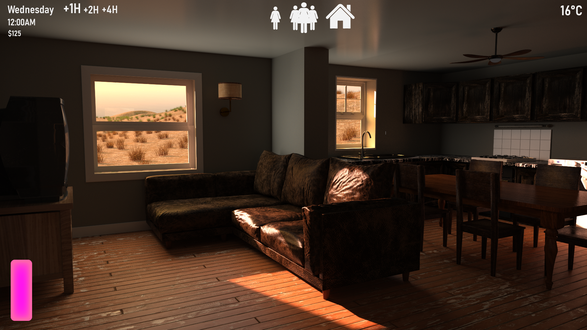
This includes: the HUD, the navigation, and the main menu (the in-game one, with the house management and stuff). And by the time this progress report gets published, I'm almost done with some heavy rewrites and additions to the intro and the very first quest. In fact I was supposed to be done with it by now, and that kinda sucks to say that I'm not to be honest, but those rewrites and additions include about 15 new/remade renders. Some of which you guys saw yesterday on my livestream ^_^
I understand this decision of reworking stuff again won't be 100% popular, but those improvements (mostly the main menu) are things I wanted to work on for a long time, but that I held off on for the sake of adding new stuff.
The game as it is now is blatantly non-user friendly... Perhaps we could even use a new term for what is it at this point... "user-hostile"? You get the point, it's terrible.
The in-game main menu for example has many menus that aren't used, some menus that are actually used are mostly empty and have only a single information on them, it's so ugly it burns the eye... Those are the main improvement points I plan to bring to the main menu.
The navigation and HUD also have issues of their own: the navigation buttons tend to be small and hard to find (even though I implemented a system to display them all, some players just refuse to use that functionality for some reason), and navigating around the house just requires too many clicks. And lastly, the HUD also has useless information on it, and is just too present. The new HUD (as you can see above) is much more subtle and clean-looking.
Anyway. I came to the conclusion that if I want my baby to be respectable (and respected), leaving blatant issues like disgusting menus and tedious usage probably doesn't help.
Please trust that I'm not planning on taking an overly long time working on this (even though this might seem as a large chunk of work, it really isn't), and this update is still supposed to include a large amount of content.

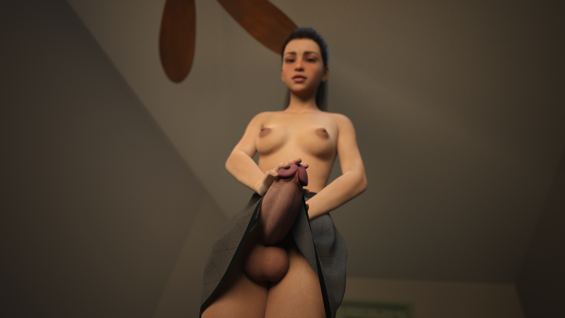
Here is a render that's a part of the introduction additions. I might as well show it to you guys as I've shown it on stream yesterday. :)
That's about it for me for today, I think. Still a lot of work ahead. See you soon :D
A Home In The Desert
An adult management game, with strong incest and futanari themes!
| Status | In development |
| Author | Misarmor |
| Genre | Visual Novel |
| Tags | 3D, Adult, Erotic, futa, incest, Management, prostitution, Sandbox |
| Languages | English |
More posts
- 0.5 Update announcementJun 10, 2025
- Progress report 01JUNJun 01, 2025
- PROGRESS REPORT 20MAYMay 20, 2025
- Progress report 10MAYMay 10, 2025
- Progress report 01MAYMay 01, 2025
- Progress report 21 APRApr 21, 2025
- Progress report 10APRApr 10, 2025
- Progress report 01APRApr 01, 2025
- Progress report 20MARMar 20, 2025
- Progress report 10MARMar 10, 2025
Leave a comment
Log in with itch.io to leave a comment.